I found this course to be challenging and very informative. Coming into the class, I had virtually no experience or formal knowledge on working with or critically examining images. Although I had previously done some work with image manipulation in the past (mostly for fun, in photoshop), I had done so without any sort of basis in theory, and in some cases, without any direction (simply aiming for something that looked "cool" or "pretty").
The readings and class discussions really helped me gain a new perspective on all of the meaning that goes into and comes out of just about any given image. Sturken and Cartwright's Practices of Looking served as a good introduction to the concepts of visual communication for me as someone who had no previous academic exposure in the field. There were a lot of relevant general themes throughout the book, such as critical examination of a photographer or image-maker's intent, the effect of image angle and framing in shaping viewers' perception, and how different image styles and media are perceived differently depending on a viewer's background, nationality, cultural knowledge, or the era the viewer is living in. There were also several chapters that addressed particularly relevant issues in image perception in greater detail; some of the latter chapters (including the ones on advertising, postmodernity, globalization, and media in everyday life) were particularly applicable to visual challenges we are likely to face in our daily lives and careers, as well as to our sub-projects for this class.
However, once we began to read Kress and van Leeuwen's Reading Images, I found it to be incomparable in terms of the wealth of concrete, applicable information it provided on visual theory, complete with a grammar-based set of vocabulary for discussing it. Ultimately, I felt that it was Reading Images which provided me with far more theoretical concepts that I could use to discuss and (more importantly) improve my sub-projects. I found the chapters on narrative representations, viewer position, modality, and composition/framing to be the most directly useful, but nearly every chapter provided me with at least some information that I was ultimately able to use to enhance my own work.
The creation of my sub-projects was also quite challenging. The greatest challenge in the latter to sub-projects was simply mastering the technology and software needed to bring my ideas to life. In both cases, I felt that I was spending more time learning how to use these tools than actually making my deliverables, which was extremely frustrating, but will be very useful in the future if I use these same technologies again. I had an easier time working with Photoshop because I was already familiar with it; however, the digital remix still provided me with many challenges in turning my ideas into feasible imagery. Because the avatar sub-project came first, it gave me ample time to learn and improve over the course of the semester, so by the end, my avatar had undergone many transformations and I had a result that I was pleased with.
Overall, I feel that I got exactly what I wanted out of this class: an in-depth understanding of the influence that visual imagery has on our lives, the theory and language I need to critically examine and discuss that imagery, and the practice and knowledge that is necessary for me to thoughtfully and effecticely create and manipulate visual imagery myself.
Thursday, April 30, 2009
Thursday, April 16, 2009
Chapter 6: the meaning of composition
This chapter discusses the relationships that different elements have based on their relative location to one another within the image. According to Kress and van Leeuwen, there are three main qualities to visual elements: information value, given to the elements depending on where they are placed within the image; salience, which refers to how much an element stands out or catches the viewer's attention, based on placement, relative size, and contrasts/sharpness/etc.; and framing, which is the presence or absense of visual devices that set elements apart or group them together.
In discussing information value, the authors discuss the messages that the placement of an element convey based on several different directional flows. The first one discussed is the left-to-right movement, wherein the left side of an image represents the "old," while the right side represents the "new." The authors present this as being the case both for images with two key elements (one on either side), as well as three-panel layouts, where the left panel represents the old, the right panel represents the new, and the central panel represents the connection between the two.
Alternately, image composition can be presented using the top-down model, wherein the top represents the ideal, while the bottom represents the real (in three-panel images, the middle panel is once again an element (or elements) joining the other two; alternately, it may be a visual element that connects the image by spanning from top to bottom).
The chapter also addresses center and margin, in cases when the principal element is at the center, with subordinate elements in the margins around it. This form of composition is less common in western imagery, although it is more popular in certain Asian cultures. Elements within the margins may have equal value, or they may be distanced from the center in gradients.
Chapter 5: Modality
According to Kress and van Leeuwen, modality refers to how "real" we perceive something to be, which is of special relevance in the visual sphere, since so much of our perception and processing of reality is based on the visual (as evidenced by phrases like "I see what you're talking about," where "seeing" refers to understanding). As stated on page 155, modality is "interpersonal," in that it does not express absolute truths, but rather, "produces shared truths aligning readers or listeners with some statements and distancing them from others."
It is important to note that the modality of a concept is not necessarily based on its lifelike visual representation; as demonstrated through the visual examples on pages 156 and 157, the photograph of two people talking does not necessarily have higher modality in representing the idea of how the speech process takes place -- depending on context, the diagrams in Fig 5.1 and 5.2 may actually have higher modality in their ability to represent the idea. Therefore, as an example, the diagram below may actually tell us more about about a chemical molecular process than a photograph of cells actually engaged in that process.


Although a major criterion for high modality in visual images is the appearance of something as "real," this form of "reality" is judged as a comparison with imaged produced through currently dominant conventions and technologies of visual representation (p. 159). This means that an image can have decreased modality if it is "too" real, exaggerated, or excessive, such as when colors are over-saturated or certain elements in an image are excessively detailed (such as the background in a realist painting-- this is the case because our dominant standard for high modality images are photographs, where the background is often less focused and therefore less detailed). In contrast, modality may be lower if, following the same examples, the colors in an image are not saturated enough, or if principal elements in the image are not in focus.
As an example, the following image has high modality, as it is very real by today's standards of representation. However, because of the saturation of the colors and the detail depicted in all elements of the image, the modality actually decreases slightly: the cutting board seems almost too focused and sharp for a backdrop, the color of the sliced fish is almost too saturated and the detail is slightly uncanny, and the contrast of the piece of fish against the white background seems a little too extreme.

Other elements which contribute to greater or lower modality include color differentiation (range between use of a diverse set of colors to monochrome), color modulation (example: many different shades of red on one end of the scale to only plain, unmodulated color on the other), contextualization (ranging from total absence of background to most fully articulated and detailed background), representation (from maximum abstraction to maximum representation), depth, illumination, and brightness.
The chapter also discusses modality in modern, abstract paintings, whose modality is not based on visual representation of objects, but rather, representing the process of representation.
It is important to note that the modality of a concept is not necessarily based on its lifelike visual representation; as demonstrated through the visual examples on pages 156 and 157, the photograph of two people talking does not necessarily have higher modality in representing the idea of how the speech process takes place -- depending on context, the diagrams in Fig 5.1 and 5.2 may actually have higher modality in their ability to represent the idea. Therefore, as an example, the diagram below may actually tell us more about about a chemical molecular process than a photograph of cells actually engaged in that process.
Although a major criterion for high modality in visual images is the appearance of something as "real," this form of "reality" is judged as a comparison with imaged produced through currently dominant conventions and technologies of visual representation (p. 159). This means that an image can have decreased modality if it is "too" real, exaggerated, or excessive, such as when colors are over-saturated or certain elements in an image are excessively detailed (such as the background in a realist painting-- this is the case because our dominant standard for high modality images are photographs, where the background is often less focused and therefore less detailed). In contrast, modality may be lower if, following the same examples, the colors in an image are not saturated enough, or if principal elements in the image are not in focus.
As an example, the following image has high modality, as it is very real by today's standards of representation. However, because of the saturation of the colors and the detail depicted in all elements of the image, the modality actually decreases slightly: the cutting board seems almost too focused and sharp for a backdrop, the color of the sliced fish is almost too saturated and the detail is slightly uncanny, and the contrast of the piece of fish against the white background seems a little too extreme.
Other elements which contribute to greater or lower modality include color differentiation (range between use of a diverse set of colors to monochrome), color modulation (example: many different shades of red on one end of the scale to only plain, unmodulated color on the other), contextualization (ranging from total absence of background to most fully articulated and detailed background), representation (from maximum abstraction to maximum representation), depth, illumination, and brightness.
The chapter also discusses modality in modern, abstract paintings, whose modality is not based on visual representation of objects, but rather, representing the process of representation.
Thursday, April 2, 2009
Chapter 4: Representation and Interaction
This chapter addresses the relationships that exist between people and/or objects in the image, the producers of the image, and the viewers of the image.
One of the more interesting ideas brought up in this chapter is the way that societal norms are brought into images. The personal space that exists in our live interactions with other people and acts as a component in defining our relationships, closeness, formality, and comfort zones, is represented within images as well. The distance and angle of an object represented in the image can determine our emotional involvement with the object and influence or level of empathy toward it. In the set of images in page 127, this is represented through the distant, "objective" images representing the events of a murder, followed by close-up images of people who knew the victim, with captions regarding their relationship with him. These close-ups mirror a point of view that would likely occur if the viewer were actually speaking with these individuals, and their direct gaze draws the viewer into the "conversation."
This ties into the authors' discussion of direct and indirect gazes within images, and acceptable norms for "looking" or "staring" at the viewer (through the camera). In some instances, this follows the conventions of live interactions (as, in the case above, when the photographed individuals look directly at the camera (and, thereby, the viewer) to engage in dialogue. In other instances, actors within an image or film cannot look into the camera, because to do so would be to break the illusion built up that they are "unaware" of being viewed.
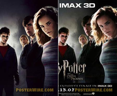
An interesting example of where these two conventions intersect is movie advertisements. Whereas, in most conventional films, characters interact with one another throughout an entire film without looking at the camera and acknowledging the viewer, advertisements for the same films often position the characters in such a way that they all stare directly at the viewer, beckoning them to engage in a gaze, thereby making an emotional connection with the characters (and subsequently, going to see the film).
Another interesting discussion in this chapter addresses cases when viewers, and viewers' relationships with the images, are defined by the images themselves. The viewer of a given ad can be defined by a narrator or character that addresses the viewer directly, and in so doing, gives them certain characteristics (as in advertisements, for example, where a narrator might say, "do you suffer from long-lasting headaches?"). However, this can also happen through various visual cues, whether by having the viewer emphasize with certain elements of the ad, or, for example, by clearly representing a person or group in the image as "other," forcing the viewer to visually identify with the "us"/producers of the image while viewing the image, even if they would not do so outside this context. The same principle can be applied through the choice of angles from which an image forces us to view an object or person, thereby subjecting the viewer to the image producer's relationship with the object or person, whether or not we share the same view.
One of the more interesting ideas brought up in this chapter is the way that societal norms are brought into images. The personal space that exists in our live interactions with other people and acts as a component in defining our relationships, closeness, formality, and comfort zones, is represented within images as well. The distance and angle of an object represented in the image can determine our emotional involvement with the object and influence or level of empathy toward it. In the set of images in page 127, this is represented through the distant, "objective" images representing the events of a murder, followed by close-up images of people who knew the victim, with captions regarding their relationship with him. These close-ups mirror a point of view that would likely occur if the viewer were actually speaking with these individuals, and their direct gaze draws the viewer into the "conversation."
This ties into the authors' discussion of direct and indirect gazes within images, and acceptable norms for "looking" or "staring" at the viewer (through the camera). In some instances, this follows the conventions of live interactions (as, in the case above, when the photographed individuals look directly at the camera (and, thereby, the viewer) to engage in dialogue. In other instances, actors within an image or film cannot look into the camera, because to do so would be to break the illusion built up that they are "unaware" of being viewed.
An interesting example of where these two conventions intersect is movie advertisements. Whereas, in most conventional films, characters interact with one another throughout an entire film without looking at the camera and acknowledging the viewer, advertisements for the same films often position the characters in such a way that they all stare directly at the viewer, beckoning them to engage in a gaze, thereby making an emotional connection with the characters (and subsequently, going to see the film).
Another interesting discussion in this chapter addresses cases when viewers, and viewers' relationships with the images, are defined by the images themselves. The viewer of a given ad can be defined by a narrator or character that addresses the viewer directly, and in so doing, gives them certain characteristics (as in advertisements, for example, where a narrator might say, "do you suffer from long-lasting headaches?"). However, this can also happen through various visual cues, whether by having the viewer emphasize with certain elements of the ad, or, for example, by clearly representing a person or group in the image as "other," forcing the viewer to visually identify with the "us"/producers of the image while viewing the image, even if they would not do so outside this context. The same principle can be applied through the choice of angles from which an image forces us to view an object or person, thereby subjecting the viewer to the image producer's relationship with the object or person, whether or not we share the same view.
Subscribe to:
Posts (Atom)