Thursday, March 12, 2009

Film project

For my third sub-project, I want to continue the theme of politics in food preparation in the form of an infomercial. There are a couple reasons for this choice. First, I think that there is an inherent power dynamic in an infomercial of almost any kind: the chef or television personality is telling you that your life has been incomplete up until now, but it is about to improve dramatically with their help. Although the most obvious and prevalent elements are simple tricks of advertising and salesmanship, there are almost always subtler cues at play as well: what is the ethos of the host? Are we listening to his message because he is a celebrity? An authoritative-looking chef? Does race, gender, and nationality play into it? And what are the relative characteristics of the individuals being shown to demonstrate the problem, or filmed to make testimonies about how the product has improved their lives?

The second reason for this choice is a more pragmatic one: I feel that as a form of film, an infomercial will provide me with the greatest amount of learning opportunities as I make it. I have studied fiction-film screenwriting in the past, so a commercial will provide me with a chance to take a different approach in conveying a message. Furthermore, because of the fast pace and rapid movement of a typical infomercial, it will provide me with the opportunity to do a lot of splicing and editing of different kinds of footage, which will probably prove to be a good experience in learning to use video-editing software (something I have zero experience with).

I began this project by researching the infomercials that are already out there. After watching many of them, I have come up with three that particularly stand out.

1. the Slap Chop infomercial

Even this "long" version of the commercial, at 3 minutes, is fairly short and to the point. What is notable about it is that, with the exception of a short section toward the end with satisfied customer testimonials (which frankly, in my opinion, are somewhat lackluster), the commercial relies almost fully on the energy and personality of Vince, the host. While he is onscreen, he is talking quickly and nonstop, while simultaneously demonstrating what the product can do. The viewer is therefore dazzled by his streaming commentary (which leaves no room for questioning or critical thought) and close-up images of the wonder-product in action. This fast pace may work to get viewers excited about the product and leave them energized and willing to buy.

2. the NuWave Oven infomercial

This commercial is significantly longer, and is structured as a 30-minute television show. It begins with a high-energy segment (lasting about 2 minutes and 30 seconds) in which an authoritative male voice talks about the problem (no time to cook, eating too much fast food, gaining weight) while illustrating with images of "real" people, and then jumps to the solution - an introduction of the problem-solving product, demonstrating how easy it is to use, and all the possibilities that it offers in terms of the variety of food it can help prepare. It follows with official-looking charts and graphs to demonstrate how energy-efficient it is, and how it complies to environmental standards. It also includes testimonies from "real" customers (small text at the bottom of the page declares that "none of the participants were paid for their testimony"). Finally, we are instructed to watch the two hosts as they show us "how we can slim down and eat healthier," while seeing slow-motion footage of the hosts discussing the product.

This first segment is very high-energy. The rest of the commercial is more low-key and is centered around the two hosts in a faux-kitchen, surrounded by plates of food prepared in the multiple NuWave Ovens on display. The hosts banter, prepare, and taste NuWave-made food. Although this is interspersed with images from outside this kitchen setting and occasional testimonies, the overall tone from here on continues to be more casual and never reaches the high level of energy we see in the first 2.5 minute segment.

3. the FlavorWave Oven infomercial

This commercial is similar to the one for the NuWave Oven in that it involves demonstrations by two hosts in a faux-kitchen. However, there are several elements that set it apart. First, this commercial gives an important role to a live audience. Whereas the NuWave kitchen appears to be a private and intimate setting with only the hosts and the camera crew, the FlavorWave demonstration has an enormous live audience whose reactions are shown regularly throughout the clip. Second, this commercial uses a well-known actor (Mr. T), and makes much more of an attempt to be funny and acted-out (starting with the initial scene, where Mr. T bursts in by breaking the door, rather than opening it). This stands in contrast to the straight-forward NuWave approach, and is not always successful in its attempts at humor.


Thursday, March 5, 2009

Reading Images: Chapter 2

In this chapter, the authors discuss narrative representations of images, and the way that the position of actors within the images determines the processes and movements perceived by the viewer.

One of the concepts that particularly stood out to me was the associations and meanings given to different geometrical shapes. Squares and rectangles are perceived as as "honest, stright, and workmanlike" (p. 54), in addition to representing technology, power, and progress, or oppression, if one is to perceive it as a literal and figurative representation of being "boxed in" (p. 55). Circular shapes, on the other hand, represent endlessness, warmth, protection, and eternity, as well as elements that are natural and organic (pp. 54-55). Finally, triangles and vectors can represent movement or ongoing action, as well as conflict and tension (p. 56). The authors also elaborate on the meanings of stretched or elongated shapes.

Thus, I was interested in looking at several images and seeing how these interpretations of geometry would apply.

This yoga demonstration has many circular (and therefore natural, organic) lines, but there is also a strong vector of movement formed by the man's outstretched arm.

Next we have two signs held up at rallies (an environmental rally and a war protest rally).
This first sign makes use of round, organic imagery, which calls for our empathy.


Meanwhile, the square nature of the sign in this picture is distinctly authoritative, calling for action. The outstretched arms of the people around it can also be seen as vectors, directing attention toward the message.

Another interesting point brought up in this chapter is that of non-transitional images containing only one actor. However, when that actor (for example, a person, such as in image 2.15 on page 64) is interacting with something that is not visible within the image, it is left to the viewers to interpret the actor's actions and make guesses about what lies beyond the borders of the image that they see, and thereby, in some cases, providing their own emotional content to the image. It seems that this can be a powerful tool in image-making and advertising.


"Vegetable Brutality"


Cottage Cheese Ad


Spinach Ad

Thursday, February 26, 2009

Digital remixing

So far, I'm not that happy with how my remixes are coming out. I have ideas that seem really great in my head, but when I try to execute them, they are less than stellar. Still, I'm sure that with some effort, they will get better.

My first idea was to mock the images of brutalized animals in vegetarian/animal rights ads by showing a "brutalized" carrot on a cutting board, bleeding, with its bones visible:


Somehow, though, I don't think it draws up much of an emotional response of any kind. So I modified it to make it more cartoonish:


My next effort refers to PETA's latest ad campaign aimed to discourage people from eating fish: sea kittens.


My first attempt to imitate this approach to discouraging carnivorous activity is a "Grazing Teddy Bear" or "Teddy Bear on the Range".


This one is a pretty primitive first draft, but I intend to work on making a more elaborate one in the coming week.

Reading Images - Chapter 1

One of the most interesting statements that Kress and van Leeuwen make in the first chapter relates to power. On page 13, they write:
Communication requires that participants make their messages maximally understandable in a particular context... On the other hand, communication takes place in social structures which are inevitably marked by power differences, and this affects how each participant understands the notion of "maximal understanding." Participants in positions of power can force other participants into greater efforts of interpretation.
It seems that this is true in many aspects of life, visual and otherwise. An obvious example of this may be the stereotypical moody boss who barks out a vague set of orders, leaving the people working for him to guess at his exact meaning in an attempt to meet his unclear demands. Yet we can see this at play in many more subtle settings. A concept may be mentioned by a professor without extensive explanation or clarity, because the professor knows that even without an explanation, students will need to research it in order to pass an exam. My experience in technical translation has also shown me that instruction manuals for home assembly of various products (furniture, etc.) tend to be more simple and clear than those for industrial devices. Now clearly, this is due in part to the presumed expertise of the user: an industrial engineer is assumed to have a wealth of knowledge and therefore require significantly less technical explanation than a college student assembling a computer desk for the first time. Still, is it possible that there are some dynamics of power at play? If the college student is frustrated with the assembly instructions, he may simply return the desk and buy another one from a different manufacturer. However, an engineer is responsible for doing her job, and figuring out how to follow the directions in her manual, regardless of how unclear the directions may be.

Another topic that the authors bring up is how visual ideas may be represented through varying means that are significant to the artist in what they represent to him or her. The notable example given is that of a 3-year-old boy, whose drawing of a car does not highlight its shape, but rather the circular motion of its wheels (in his representation through circles). In this way, the meaning of the resulting picture may not be immediately clear to an outside observer without an explanation, but the image carries clear meaning to its creator. Because of the child's background of knowledge and associations, this set of symbols is entirely logical and meaningful. Both this book and our previous text talk about the importance of context and background knowledge in interpreting images. Reading Images mentions the fact that we may perceive artistic artifacts from other cultures as beautiful, interesting, or bizarre, but we may be incapable of understanding their meaning because we are not a part of that culture, and do not have the background information and cultural associations that allow particular symbols to represent concrete ideas.

But I would like to return to the idea of visual representation through the motion of creating an image. I decided to search for examples of modern art that employ associations of motion, rather than visual associations, in making a painting.

One well-known artist who focused on motion in the creation of his paintings was Jackson Pollock. He eschewed the easel and paintbrush, and preferred unconventional tools, such as sticks, trowels, and knives, as well as dripping and splattering paint onto a canvas on the floor from all four sides.


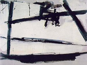
His work was part of the Action Painting movement, which eschewed the conventional use of paintbrushes to create careful images, and instead focused on the physical act of producing the painting as an important element of the art itself. This work by Franz Kline is also a well-known example of action painting:


Friday, February 20, 2009

Chapters 9 and 10

In Chapter 9, which discusses imagery in relation to science and biology, I was initially surprised by the very public spectacles of anatomy theaters in past centuries, where cadavers were operated on in displays before large crowds, as a form of entertainment. Today, it seems improbable that people would flock together to an arena to watch a body get sliced apart and see what is inside. It then occurred to me, however, that this particular practice in "looking" within bodies is alive and well today, through television. It's true that the popularity of medically-themed television shows can be attributed to many factors, ranging from the personal drama in the medical staff's relationships to fascination with rare and surprising medical cases (a fascination whose basis have may have nothing to do with visual elements). Still, doesn't at least part of the interest in shows such as Grey's Anatomy stem from a voyeuristic desire to see inside people's bodies and to vicariously experience the characters' excitement in cutting people up?


A quick google search reveals (not surprisingly) that in this modern version of the anatomic arena, all of the blood and organs shown are fake. This brings us back to issues addressed at the beginning of the book; namely, how real is an image that is manipulated or staged? Is the entertainment value of these shows affected by the fact that these portrayals of the human body do not use real organs? And if these organs were used in a program intended for medical education, would it matter more than the body components are fake, even if they were portrayed in an exact, true-to-life manner?


In Chapter 10, the authors address the global flow of visual culture. One of the issues discussed is the ubiquity of certain companies (particularly restaurants and coffeehouses) that are spread throughout the world, which allow individuals in many places that are distant from one another to experience the same atmosphere (including visual elements).

However, this is not entirely true. The book speaks about the relationship between globalization and localization, and it is a relationship that can be observed in even such seemingly cloned franchises as McDonald's restaurants. All around the world, adjustments are made to accommodate local culture--for example, the Maharaja Mac in India, which is made of lamb or chicken (beef and pork are not served for religious reasons). Localized items are also offered simply to accomodate local tastes: hence the McKebab in Israel, McKrokets (Dutch croquettes) in the Netherlands, the Bulgogi Burger in South Korea, and the Korokke Burger in Japan, which is a sandwich with breaded mashed potatoes, shredded cabbage, and katsu sauce. Several Asian countries also offer burgers whose contents are sandwiched between two patties of glutinous rice.


Still, when a large global corporation takes elements of local culture and incorporates them into their product line, which is the winner, local culture or globalized influence? Let us look at an example more directly tied to images: if a beauty product company from an outside culture creates billboard advertisements that use local models and elements of local decor to sell its product line, does it still run the risk of influencing another culture's perceptions by representing its own standard of beauty as ideal?

Thursday, February 5, 2009

Chapters 7 and 8

In discussing advertising and postmodernism, Sturken and Cartwright spend a lot of time talking about consumer culture and its effect on modern society. It is interesting to look at the way that consumer culture developed over the course of time, on the initial basis that shopping was not merely a chore but something one could do for pleasure, as a way to engage the senses (particularly, the visual). On p. 270 and 271, the authors discuss the importance that visual pleasure played in the development of this trend: shopping arcades and the first department stores were designed in visually appealing ways that were novel for that era. It is interesting to make this connection to the shopping cultures in today's world, and how this idea was integrated into different societies. In the United States, the modern version of the 19th century arcade is the shopping mall. Indeed, when entering the mall, one is often surrounded by appealing visuals (as well as sounds and smells), with everything possible being done to entice the shopper to stay a while-- all necessary amenities, such as food courts, restrooms, and sometimes even message parlors, are available within its confines. What is interesting is that although malls are often fully-indoor facilities, it is increasingly common to find malls (particularly upscale ones) that emulate an outdoor environment: floors made to look like cobblestone streets, outer shop walls that look like outdoor storefronts, etc. I find this curious because the early arcades were aimed at providing the opposite: a shopping experiences shielded from all that is outside, in a place where the sounds, smells, and sensations of street life do not affect the shopper. Clearly, in today's outdoor-like malls, one could say that the best of both worlds is achieved: we are given the illusion of being outdoors, but it is the "fake" outdoors, without any bothersome realities such as inclement weather, dirt, or unsavory smells. The book addresses this kind of meta-reality in Chapter 8, when discussing World Park in Beijing, where replicas of various famous landmarks around the world are displayed. It is to note that, like Chinese tourists visiting the "Eiffel Tower" at the World Park without ever actually seeing the real tower, some city- or suburb-dwelling Americans have never actually had the experience of shopping on the Main Street of a small American city; instead, their point of reference for this is the simulated experience provided by malls that Emulate a small-town shopping street.

Thursday, January 29, 2009

Chapters 5 and 6

In Chapter 5, Sturken and Cartwright examine copying and reproducing images. One particularly relevant topic in today's society is the one addressed toward the end of the chapter: digital modification of images. This issue addresses the question raised in class last week, "what constitutes a 'real' image?" When images are manipulated for seemingly benign purposes (airbrushing or otherwise improving someone's appearance on a photo in an advertisement), it may provoke criticism of creating an unrealistic beauty standard, but it rarely affects world-changing ideologies. However, when images are manipulated for political gain, the effects may be very different.

William J. Mitchel is quoted as saying that digital images should be regarded as "fragments of informatin that circulate in high-speed networks ... and can be received, transformed, and recombined like DNA to produce new intellectual structures having their own dynamics and value" (p. 219). What, then, do we make of the increasingly common instances when digital images are deliberately manipulated for news distribution? The book gives an example of a doctored photograph of the president addressing a group soliders, such that president's audience appears significantly larger than it actually was. While this is a relatively innocuous example of alteration in a source of news, there have been examples of far more mendacious images making the news in the last several years.

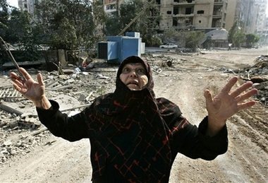
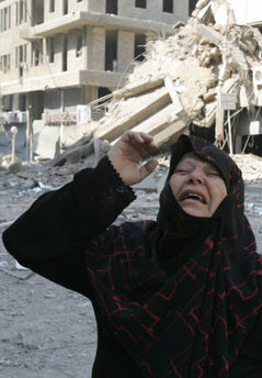
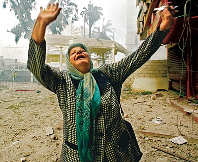
A striking example of this phenomenon comes from photographs taken during the 2006 Israel-Lebanon conflict. The controversy involves multiple photos published by the Reuters news service depicting scenes from the conflict. The controversy began when bloggers first pointed out clear indications on the published photographs of digital manipulation, which can be seen in the image comparison below (the image on the left is altered, the image on the right is the original).


Further research showed that many of the photographs provided by freelance Lebanese photographer Adnan Hajj were in fact altered, or staged. This website provides many other examples of "candid" news photo manipulation, including mis-captioning and placed objects. It also demonstrates a series of staged scenes (released in news photographs at different times) where the same woman "finds" her home destroyed by Israeli fire on three different dates, in three different locations.


Thus, although these may indeed be fragments of information that produce "new intelletual structures having their own dynamics and value," they are nevertheless regarded in the specific context of providing what viewers assume is honest, objective information. Thus, we can see that through image alteration, individuals and organizations can go far beyond promoting a political agenda; in fact, they can fully affect the perception of reality by individuals or masses of people.

It is clear that the controversy following these pictures ("Reutersgate") was warranted. After all, how could top photographic editors miss signs of alteration that did not escape internet bloggers? But here, perhaps, we are faced with one of today's realities in reporting news, which is that extreme, sensational news sells better. Therefore, is it possible that signs of alteration were overlooked (unintentionally or purposefully) because they would "sell better" (be more exciting to the public) than reality? Was the photo editor responsible partial in some way to one of the sides in the conflict, and reluctant to critically examine a photo promoting a view he believed in? And most importantly, how easy and frequent are these sorts of alteration in more common, less politicized settings? After all, when a news story is less emotionally charged, bloggers are less likely to examine accompanying photos for signs of alteration or changes.

Thursday, January 22, 2009

Chapters 3 and 4

The concepts covered by Sturken and Cartwright in these chapters include power systems that define our perception of images and the images that shape our perceptions, as well as the prevalence of intrusive "gazing" into our daily lives, in the form of surveillance cameras and photographic identification, and its effect on our behavior.

The idea that people's behavior may be regulated by the mere possibility of being observed at any given moment was at the center of Jeremy Bentham's idea for designing a panopticon, a type of prison where inmates could be heard and observed at any time, but could not know whether or not they were being monitored during any given moment. This is a form of the power/knowledge relationship that Foucault writes about; Foucault argues that through photographic surveillance, citizens become "docile bodies of the moern state," participating in the ideologies of society because of a desire to fit in (p.110). The book presents examples of modern surveillance (in the form of CCTV cameras) that can also contribute to this effect on society.

The description of the panopticon brings to mind works by German photographer Andreas Gursky. Among his works are a series of photographs representing urban diversity, which includes several photographs of enormous residential buildings.


In larger versions of these images, you can actually see into many of the apartments whose shades are open. Thus, in a way, Gursky creates an intrusion into people's privacy through the creation of visual imagery (and unlike the surveillance cameras in public places, here, strangers are able to gaze into individual's homes). When I first saw these photographs, I was fascinated by the chance to look into individuals' windows; I felt curious about the variety of ways in which people arranged and decorated identical living spaces. However, the analysis of the power/knowledge concept leads me to wonder how much of my fascination was unconsciously linked to the power of gazing into unsuspecting people's homes.

Tuesday, January 20, 2009

context

In chapter 2 of Practices of Looking, Sturken and Cartwright talk about the meaning given to images by their viewers, and the role that contexts that work to frame viewers' perceptions. When thinking about shifts in context, one of the first things that comes to mind is an experiment performed by the Washington Post two years ago. In the experiment, Joshua Bell, one of America's greatest violinists, played his $3.5 million violin as a busker in a Washington, DC metro station during morning rush hour. Bell typically plays sold-out concerts where seats can easily cost well over $100. In this experiment, the Washington Post wanted to see how he would be perceived by the public in a completely different context, that of a musician they rush past on their way to work.

Although expectations were not that high, the experimenters were surprised by just how little attention Joshua Bell received from passers-by. Here, context plays a critical role. To quote from the article:
"When you play for ticket-holders," Bell explains, "you are already validated. I have no sense that I need to be accepted. I'm already accepted. Here, there was this thought: What if they don't like me? What if they resent my presence . . ."
The article then compares this to the role of context in visual art, by quoting Mark Leithauser, senior curator at the National Gallery:
"Let's say I took one of our more abstract masterpieces, say an Ellsworth Kelly, and removed it from its frame, marched it down the 52 steps that people walk up to get to the National Gallery, past the giant columns, and brought it into a restaurant. It's a $5 million painting. And it's one of those restaurants where there are pieces of original art for sale, by some industrious kids from the Corcoran School, and I hang that Kelly on the wall with a price tag of $150. No one is going to notice it. An art curator might look up and say: 'Hey, that looks a little like an Ellsworth Kelly. Please pass the salt.'"
In both cases, context plays a major role in whether people perceive a work or expression of art as being worthy of their attention (although it is also true that while people who pay for concert tickets specifically set aside time to enjoy the music, the passers-by in the metro station were rushing to work). When most people enter an art museum, they put themselves into a mindset where they are ready to perceive Art. This (along with a sometimes hefty entrance fee) means that people will generally perceive such works as Marcel Duchamp's Bicycle Wheel or Kazimir Malevich's Black Square in a very different way than they would elsewhere (in an "unframed" context.


Still, on some level, all this is to be expected. I am on the lookout for other experiments of this sort, dealing with subtler differences in context, visual and otherwise.